Getting the Look
In developing an overall visual style for Future Perfect, we encountered a few problems that we hadn’t come across in previous games. Chief among these is that it’s difficult to define a consistent visual style for a project that’s so heavily defined by variety and user-generated content. The fact that the “game” is really a collection of games, tools and other components means that there’s no obvious theme or backstory to develop a style out of.
That Retro Vibe
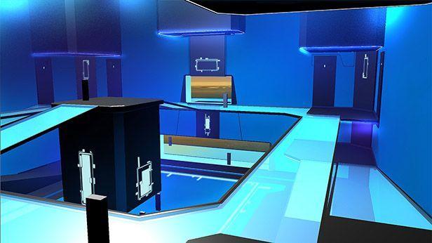
In the end we decided that, because we would be shipping our own game modes alongside the tools for making them, it was still important to have a strong visual style and to use it to define the visuals of the entire project. For a long time now, I have wanted to do a project with a strong, stylised 1980s-inspired retro-futuristic theme. I have always loved the notion of a distant reality that those grainy, airbrushed images evoked: an alternate future that never really came into existence. Because this game is all about you, the players, creating your own alternate realities, the aesthetic felt to us like it would be a great fit. To us, this meant:
- Lots of very strong colours, often across the full spectrum.
- Many highly reflective surfaces (they sure loved their airbushes).
- Typically, but not always, bright colours over darker backdrops.
- Sometimes a general graininess or noise over the whole image (probably due to imperfect image reproduction but it’s since become part of the look).
Simulated Reality
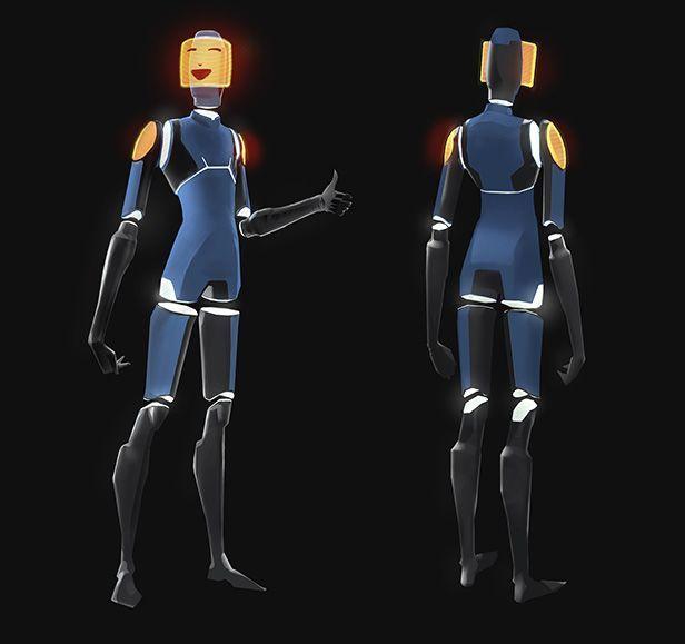
The world of Future Perfect is a digitally-created dream world called “The Spectrum”. In this world shapes and forms are simplified into abstractions of their real-world counterparts. Our character, the Avatar, is a great example of this. To limit the requirement that there be a different player character for every game mode created (which would be as much of a problem for us as for our users), we decided to create a multi-purpose player character that was a native of this digital world. The goal was to have a player character that would feel at home in any given game, and for the players to feel at home as the character.

Lighting, Shaders Materials & Colour
We want it to be as easy as possible to create new environments, and for you to extend the theme with new artwork. We’ve focused on engine technology and a visual style that allows the building of low-detail environments that still have an overall high visual quality. This means a less weighty art process, and focuses on making it easy for users to quickly build interesting spaces. To this end we’ve made (and are working on) a number of improvements to lighting and rendering in the Spark engine. In our style, materials are low on surface detail and uncluttered, but give off a feeling of being solid and “present”. Colours are generally strong and vibrant. Strong contrast, including between light & dark, matt & reflective surfaces and contrast between colours is the order of the day.


